I’m going to need the help of the entire Applied Epi Cinematic Universe for this one!
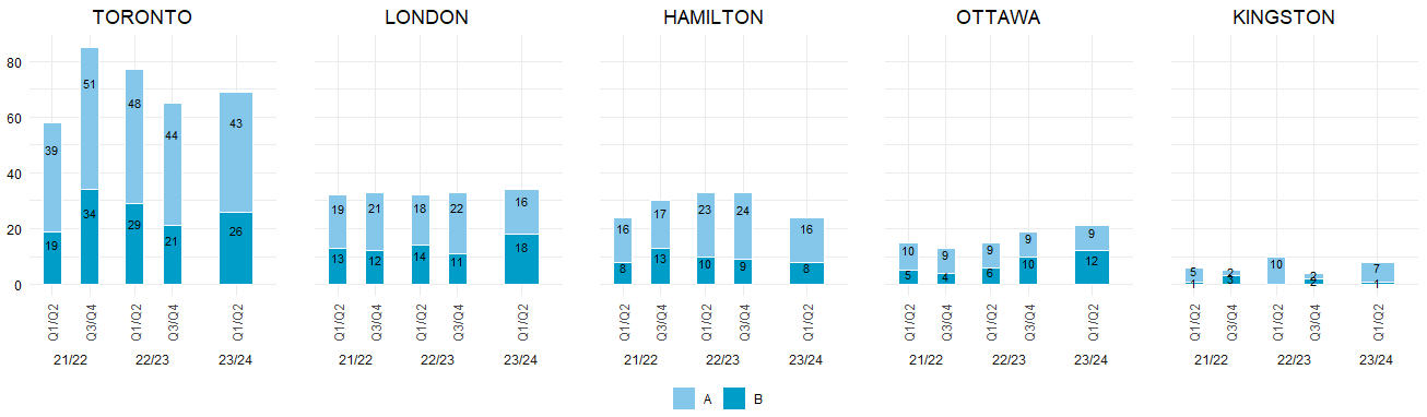
I have an Excel graph that I am trying to reproduce in R. Here is the original:

Notice that there are three levels in the x-axis - quarters_combined, fiscal_year and total_hospital_region.
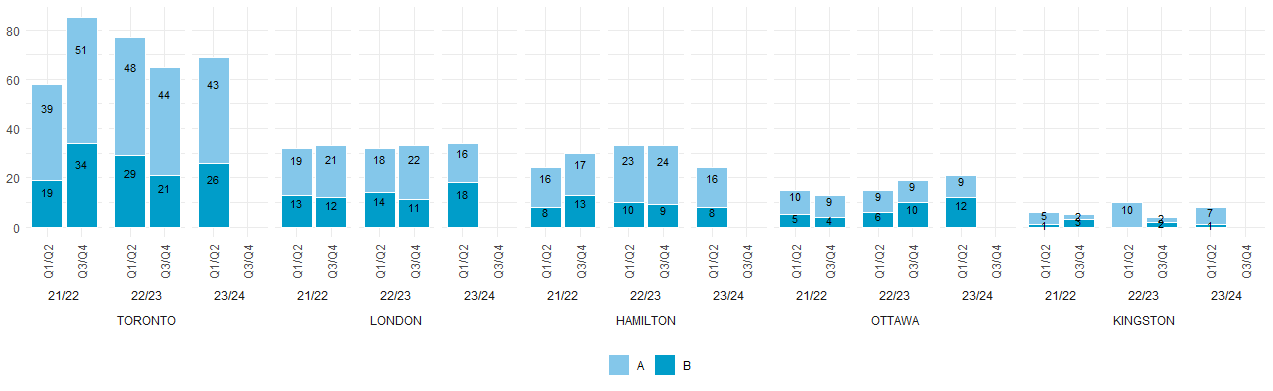
I cannot seem to make the x-axis in the same way. Here is my latest attempt:

I have two issues:
1) How do I recreate the x-axis labels in the same way? I need the total_hospital_region to be grouped instead of repeated and the order of the levels to the same.
2) How do I get the bar width to be the same in all the bars? Notice that when there is only “Q1/Q2”, the bar width doubles to equal the same as both “Q1/Q2” and “Q3/Q4”.
Here is my reproducible code for what I have done so far:
data_grouped <- tibble::tribble(
   ~total_hospital_region, ~fiscal_year, ~quarters_combined, ~outcome_detail,  ~n,
                "TORONTO",      "21/22",            "Q1/Q2",                 "A", 39L,
                "TORONTO",      "21/22",            "Q1/Q2",                 "B", 19L,
                "TORONTO",      "21/22",            "Q3/Q4",                 "A", 51L,
                "TORONTO",      "21/22",            "Q3/Q4",                 "B", 34L,
                "TORONTO",      "22/23",            "Q1/Q2",                 "A", 48L,
                "TORONTO",      "22/23",            "Q1/Q2",                 "B", 29L,
                "TORONTO",      "22/23",            "Q3/Q4",                 "A", 44L,
                "TORONTO",      "22/23",            "Q3/Q4",                 "B", 21L,
                "TORONTO",      "23/24",            "Q1/Q2",                 "A", 43L,
                "TORONTO",      "23/24",            "Q1/Q2",                 "B", 26L,
                 "LONDON",      "21/22",            "Q1/Q2",                 "A", 19L,
                 "LONDON",      "21/22",            "Q1/Q2",                 "B", 13L,
                 "LONDON",      "21/22",            "Q3/Q4",                 "A", 21L,
                 "LONDON",      "21/22",            "Q3/Q4",                 "B", 12L,
                 "LONDON",      "22/23",            "Q1/Q2",                 "A", 18L,
                 "LONDON",      "22/23",            "Q1/Q2",                 "B", 14L,
                 "LONDON",      "22/23",            "Q3/Q4",                 "A", 22L,
                 "LONDON",      "22/23",            "Q3/Q4",                 "B", 11L,
                 "LONDON",      "23/24",            "Q1/Q2",                 "A", 16L,
                 "LONDON",      "23/24",            "Q1/Q2",                 "B", 18L,
               "HAMILTON",      "21/22",            "Q1/Q2",                 "A", 16L,
               "HAMILTON",      "21/22",            "Q1/Q2",                 "B",  8L,
               "HAMILTON",      "21/22",            "Q3/Q4",                 "A", 17L,
               "HAMILTON",      "21/22",            "Q3/Q4",                 "B", 13L,
               "HAMILTON",      "22/23",            "Q1/Q2",                 "A", 23L,
               "HAMILTON",      "22/23",            "Q1/Q2",                 "B", 10L,
               "HAMILTON",      "22/23",            "Q3/Q4",                 "A", 24L,
               "HAMILTON",      "22/23",            "Q3/Q4",                 "B",  9L,
               "HAMILTON",      "23/24",            "Q1/Q2",                 "A", 16L,
               "HAMILTON",      "23/24",            "Q1/Q2",                 "B",  8L,
                 "OTTAWA",      "21/22",            "Q1/Q2",                 "A", 10L,
                 "OTTAWA",      "21/22",            "Q1/Q2",                 "B",  5L,
                 "OTTAWA",      "21/22",            "Q3/Q4",                 "A",  9L,
                 "OTTAWA",      "21/22",            "Q3/Q4",                 "B",  4L,
                 "OTTAWA",      "22/23",            "Q1/Q2",                 "A",  9L,
                 "OTTAWA",      "22/23",            "Q1/Q2",                 "B",  6L,
                 "OTTAWA",      "22/23",            "Q3/Q4",                 "A",  9L,
                 "OTTAWA",      "22/23",            "Q3/Q4",                 "B", 10L,
                 "OTTAWA",      "23/24",            "Q1/Q2",                 "A",  9L,
                 "OTTAWA",      "23/24",            "Q1/Q2",                 "B", 12L,
               "KINGSTON",      "21/22",            "Q1/Q2",                 "A",  5L,
               "KINGSTON",      "21/22",            "Q1/Q2",                 "B",  1L,
               "KINGSTON",      "21/22",            "Q3/Q4",                 "A",  2L,
               "KINGSTON",      "21/22",            "Q3/Q4",                 "B",  3L,
               "KINGSTON",      "22/23",            "Q1/Q2",                 "A", 10L,
               "KINGSTON",      "22/23",            "Q3/Q4",                 "A",  2L,
               "KINGSTON",      "22/23",            "Q3/Q4",                 "B",  2L,
               "KINGSTON",      "23/24",            "Q1/Q2",                 "A",  7L,
               "KINGSTON",      "23/24",            "Q1/Q2",                 "B",  1L
   )

# install and load packages
pacman::p_load(tidyverse)

# Set color palette
colors <- c("#009DC9", "#84C7EA")

# Create the ggplot
ggplot(data_grouped, aes(x = quarters_combined, y = n, fill = outcome_detail)) +

# Stacked bar chart
geom_col(position = "stack", color = "white", width = 0.7) +

# Add data labels
geom_text(aes(label = n), position = position_stack(vjust = 0.5), size = 3) +

# Customize axes labels and title
labs(x = "", y = "") +

# Facet by total_hospital_region
facet_wrap(~total_hospital_region + fiscal_year, scales = "free_x", nrow = 1, strip.position = "bottom") +

# Customize theme if necessary
theme_minimal() +

# Customize legend
scale_fill_manual(name = "Outcome Detail", values = setNames(colors, c("B", "A"))) +

# Adjust x-axis labels
theme(axis.text.x = element_text(angle = 90, hjust = -0.5, vjust = 1),
      legend.position = "bottom",
      legend.title = element_blank()
      ) +

# Make bars all the same width
theme(panel.spacing.x = unit(0, "mm"))
Thanks in advance!