Hello everyone, the {apyramid} have been quite good for plotting age pyramid plots for quick age-sex pyramid plots. We have a question from Cambodia cohort on how to plot population pyramid from DHS data across years with overlapping bars from the different years in one plot?
I have searched across forums and [plot - Population pyramid w projection in R - Stack Overflow] have similar examples to what it should look like except the projections are not needed.
Is there a possibility to do the same plots using the age_pyramid function {apyramid} package or any other simpler method? I have tried the stack_by argument, but it gives stacked plots instead.
I am not overly familiar with the apyramid package but it appears it is not capable of doing what you are interested in.
However, you could totally write some code to do it using the ggplot2 package. Below is how I would approach the problem. Of course, you could generalize it but this should get you started.
hey berhe - the apyramid code you showed, should do what you have asked for.
We have an example in the vignette that stack_by a categorical var (down the bottom just before survey data), but i think we set a limit so if the number of levels >=2 then it would switch to a side-by-side bar. Maybe we need to reconsider this…
sorry @berhe_tesfay I now see what you mean about the stacks.
The first dense bit of this code is just copying the data from stackoverflow. Code for the plot is from “ADAPT DATA” onwards.
Need to do a bit of fiddling to get the difference in counts by year - and then can pass it to {apyramid}.
Not entirely sure this is easier than just using {ggplot} as @machupovirus did …
library("dplyr") ## data wrangling
library("tidyr") ## data wrangling
library("wpp2015") ## example data from stackoverflow
library("apyramid") ## plot pyramid
library("ggplot2") ## edit pyramid (add steps)
############# GET DATA
## this section is just copy pasted from
# https://stackoverflow.com/questions/15816073/population-pyramid-w-projection-in-r
#load data in wpp2015
data(popF)
data(popM)
data(popFprojMed)
data(popMprojMed)
#combine past and future female population
df0 <- popF %>%
left_join(popFprojMed) %>%
mutate(gender = "female")
#> Joining, by = c("country", "country_code", "age")
#combine past and future male population, add on female population
df1 <- popM %>%
left_join(popMprojMed) %>%
mutate(gender = "male") %>%
bind_rows(df0) %>%
mutate(age = factor(age, levels = unique(age)))
#> Joining, by = c("country", "country_code", "age")
#stack data for ggplot, filter World population and required years
df2 <- df1 %>%
gather(key = year, value = pop, -country, -country_code, -age, -gender) %>%
mutate(pop = pop/1e03) %>%
filter(country == "World", year %in% c(1950, 2000, 2050, 2100))
#add extra rows and numeric age variable for geom_step used for 2100
df2 <- df2 %>%
mutate(ageno = as.numeric(age) - 0.5)
df2 <- df2 %>%
bind_rows(df2 %>% filter(year==2100, age=="100+") %>% mutate(ageno = ageno + 1))
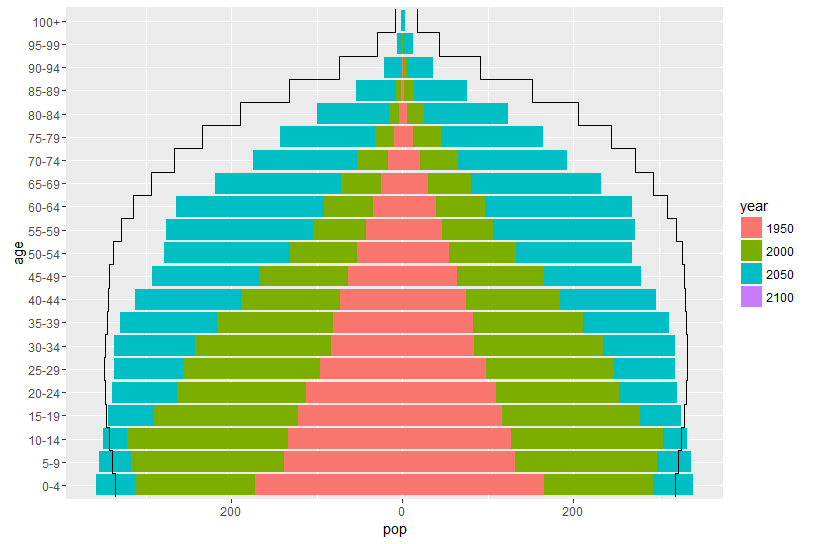
####### ADAPT DATA
## here we need to edit our counts so that just the difference is shown
## (i.e. the extra for each year)
## create a new data set
df3 <- df2 %>%
## drop the prediction year
filter(year != 2100) %>%
## sort data by appropriate groups
arrange(age, gender, year) %>%
## calculate the difference between current and previous year
mutate(new_pop = pop - dplyr::lag(pop)) %>%
## replace first year with the original count
mutate(new_pop = if_else(year == 1950, pop, new_pop))
## plot age pyramid as normal
age_pyramid(df3,
age_group = age,
split_by = gender,
stack_by = year,
count = new_pop,
show_midpoint = FALSE) +
## add in line for 2100 (this is copy pasted from stack overflow but just added in pop)
## note that this uses the original dataset
#steps for 2100
geom_step(data = df2 %>% filter(gender == "female", year == 2100),
aes(x = ageno, y = pop), size = 1) +
geom_step(data = df2 %>% filter(gender == "male", year == 2100),
aes(x = ageno, y = -pop), size = 1)
I am tagging @bsomethea because he was originally asking the question in the Cambodia cohort.
Somethea, @berhe_tesfay was investigating your question about stacked age pyramids. There are some solutions posted by the team. You can use this forum to post other questions as well.
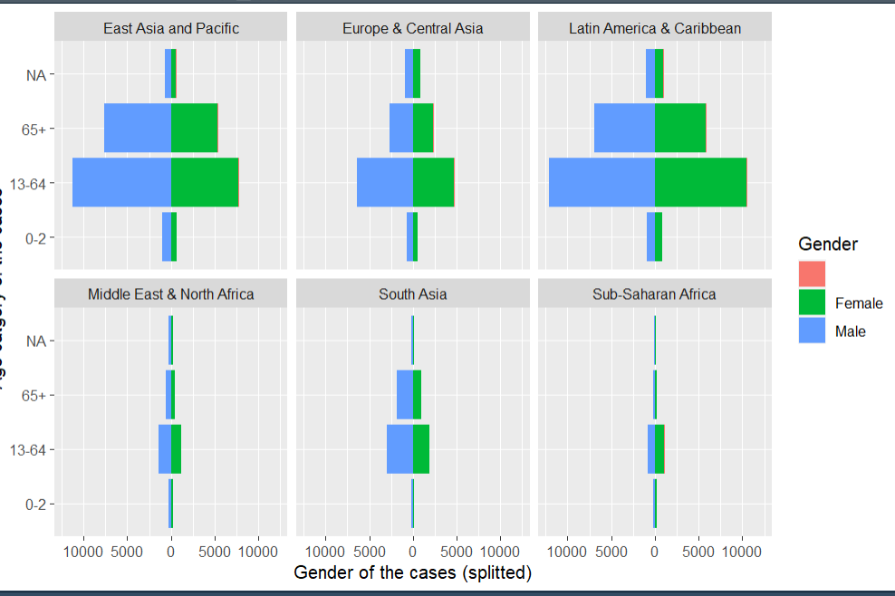
I want to do an age pyramid splitting by gender for different countries in my dataset.
age pyramid
age_pyramid(data = combined,
age_group = “age_cat”, #note that the column must be enclosed in quotation marks (" ")
split_by = “gender”,
proportional = TRUE,
na.rm = TRUE)
Can I use split_by = “gender” and add another split_by =“country” at the same time? This has been my challenge.
This code does not work. I need to fix this urgently. Been on it for over a week and close to my deadline.
age_pyramid(data = combined,
        age_group = "age_cat", #note that the column must be enclosed in quotation marks (" ")
        split_by = "gender",
        proportional = TRUE,
        na.rm = TRUE)  +
 facet_wrap(~country)
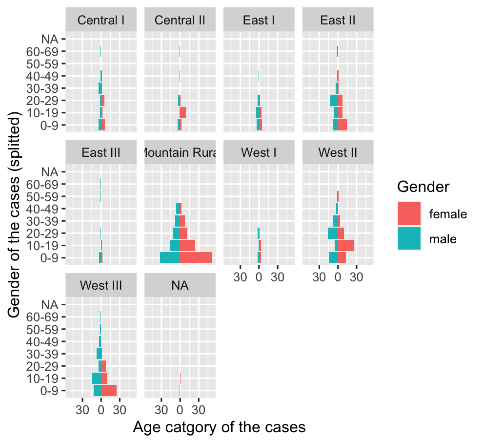
Hi @maworh, if you are looking to facet the pyramid plot, the following code should solve it for you. If you are looking to fill it by country just change the fill gender to the district which is multi level. after that the game is about
pyr_data <- combined %>%
        # select the variables of interest (consider district is a country)
        select(age_cat, gender, district) %>%

        # group  by the selecting variables
        group_by(age_cat,gender, district) %>%

        # create the grouped case count
        summarise(
                n = n()
        )

# use ggplot to plot the population pyramid
ggplot(data = pyr_data,
       aes(x = age_cat,         # x-axis is age cat
           fill = gender,       # fill by gender
           # create the left and right values
       y = ifelse(gender == "male", -n, n))) +
        # fix identity to stat otherwaie will throw error
        geom_bar(stat = "identity") +
        # use abs for labels
        scale_y_continuous(labels = abs,
                           # change the negative value to the left to positive my multplying fixed interval
                           limits = max(payramid_data$n)*c(-1,1)) +
        labs(x = "Gender of the cases (splitted)",
             y = "Age catgory of the cases",
             fill = "Gender") +
        # flip the bar chart
        coord_flip() +
        # facet by district (in your case it will be country)
        facet_wrap(~district)
If you want to use country as a fill, just change the fill = gender in to fill = district in this cases and country in your scenario. I hope this is helpful.
@mabelaworh you can drop the NA values before you plot the pyramid. however in you case first you need to change the empty place holder to NA I guess, as it is not clear in your legend. to drop the NA value, you can use multiple ways including filter but the easiest see below.
# first create the summarised data set from the combined data
pyr_data <- combined %>%
        # first make sure NA values are properly leveled
        mutate(age_cat = na_if(age_cat, "")) %>%
        # drop the missing values of NA
        drop_na(age_cat) %>%
        # select the variables of interest (consider distict is a country)
        select(age_cat, gender, district) %>%
        # group  by the selecting variables
        group_by(age_cat,gender, district) %>%
        # create the grouped case count
        summarise(
                n = n()
        )
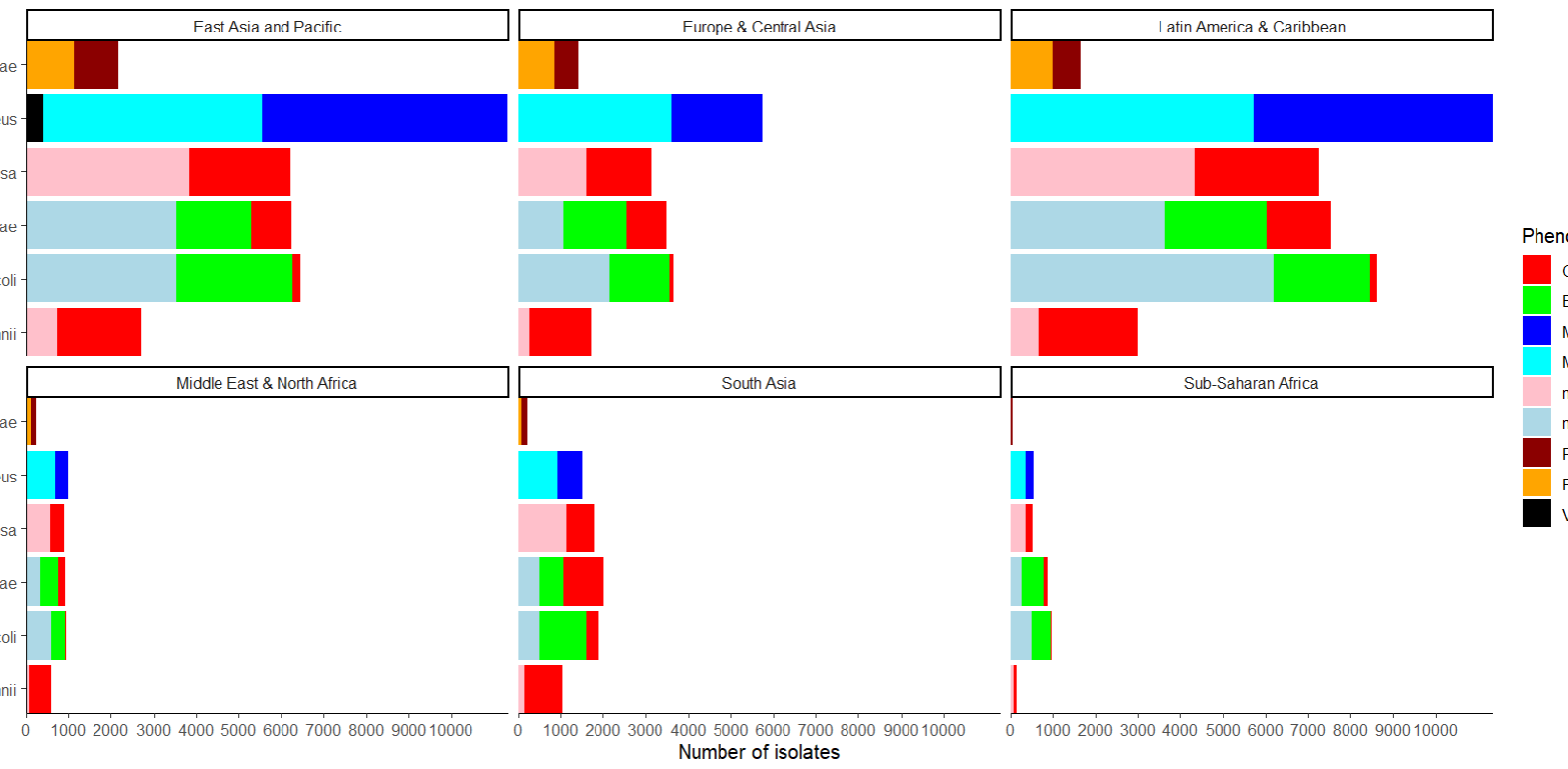
Got another challenge while trying to plot multiple bar charts with this code everything is fine.
ggplot(
data = regions,
mapping = aes(
x = species,
fill = Phenotype)) + scale_fill_manual(values = phenotype_colors) +
geom_bar() +
scale_y_continuous(breaks = seq(from = 0,
to = 10000,
by = 1000),
expand = c(0,0)) +
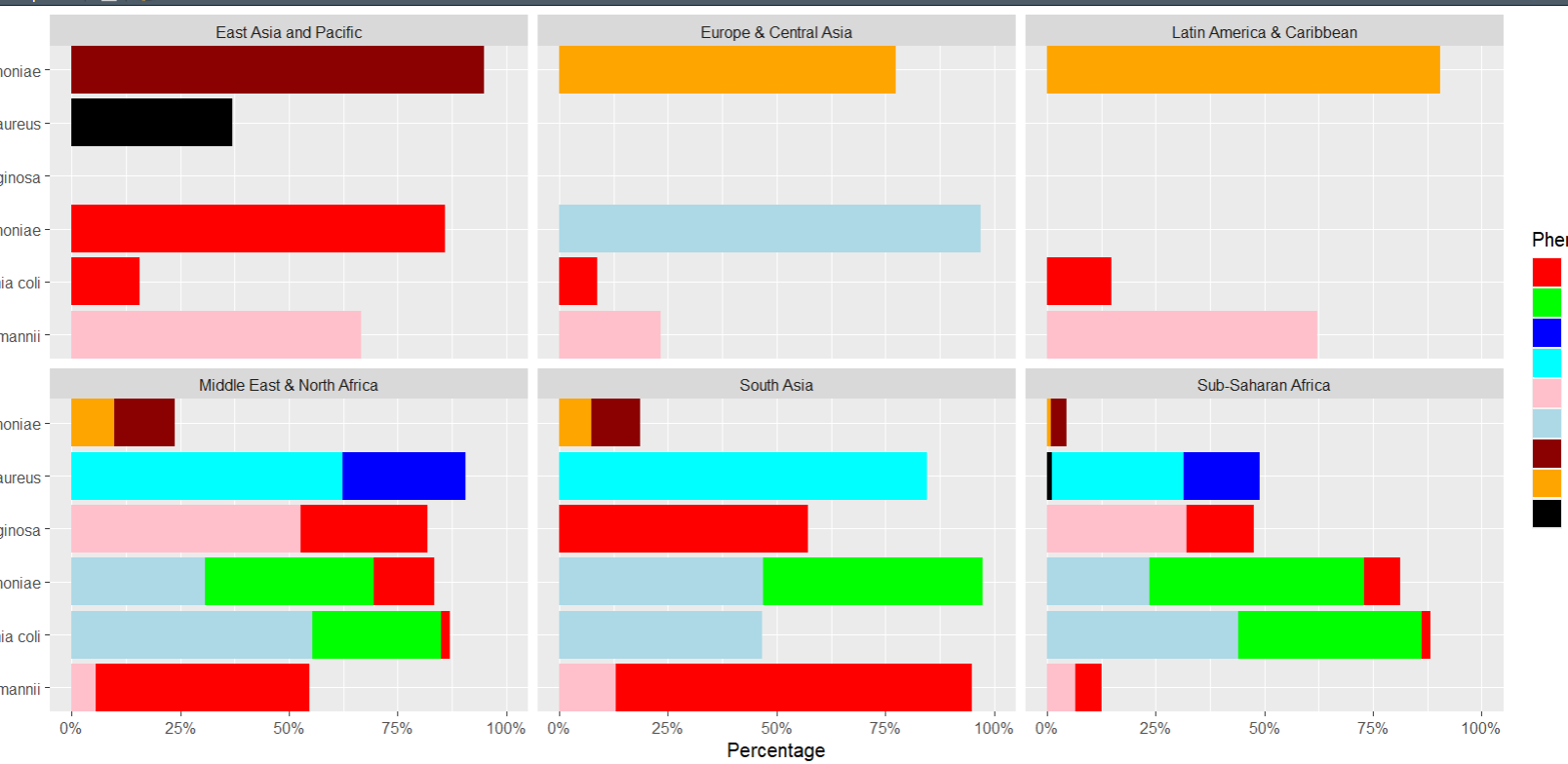
But with this code some rows are deleted even though there are no missing data
ggplot(
data = regions2,
mapping = aes(
x = species, y = percentages,
fill = Phenotype)) +
geom_bar(stat=“identity”) +
scale_fill_manual(values = phenotype_colors) +
scale_y_continuous(labels = scales::percent, limits = c(0, 1)) +
scale_x_discrete(expand = c(0, 0)) +
coord_flip() +
facet_wrap(~ Regions) +
labs(
title = ,
x = “Species”,
y = “Percentage”)
If @berhe_tesfay was able to help you, can you mark his response as the “Solution” please?
Then you can ask your next question in a separate post. This way, it is easier for other people to find the helpful conversations later.
If possible, can you view this video about how to provide a “reproducible” code example with your question? It makes it much easier for us to help you.
At the least, it is nice to put you code in “back ticks” like this:
```
#paste your code here
data <- import(...)
```
This makes it easier for us to copy and paste it into R.
Happy to answer any questions you have about the above!
Neale